Product Designclient

Ma Adjo's Kitchen

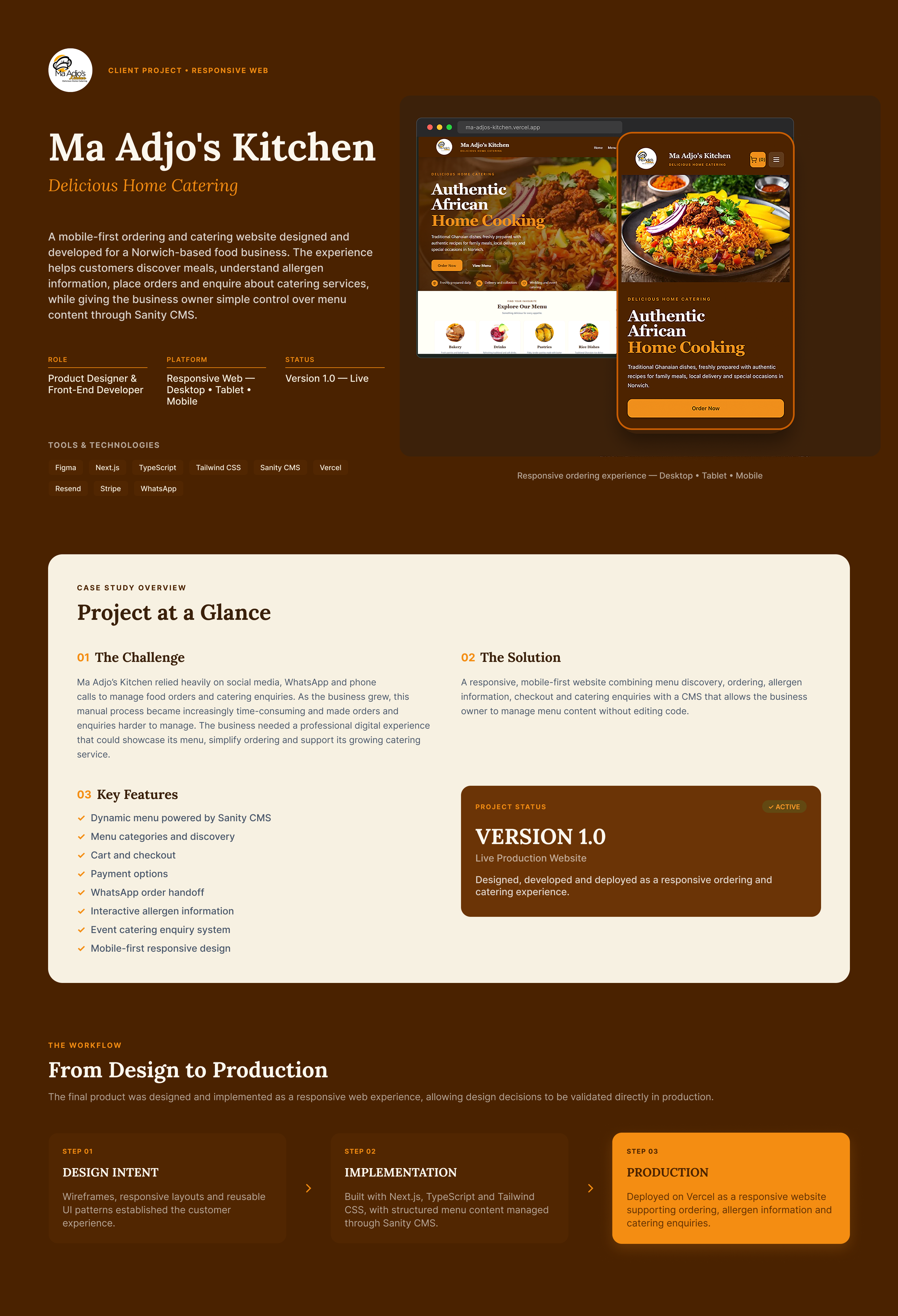
A mobile-first ordering and catering website designed and developed for a Norwich-based food business, creating a more structured customer journey while giving the business owner direct control over menu content through Sanity CMS.

Responsive Ma Adjo’s Kitchen food ordering and catering website shown across desktop and mobile interfaces.

Ma Adjo’s Kitchen responsive ordering and catering experience, designed for desktop, tablet and mobile.

Role

Product Designer & Front-End Developer

Timeline

4-8 weeks

Platform

Responsive Web-Desktop . Tablet . Mobile

Tools

FigmaFigJamNext.jsTypeScriptTailwind CSSSanity CMSVercelResendStripeWhatsApp

Team

Solo product design and development project

Responsibilities

Product StrategyUX ResearchInformation ArchitectureUser FlowsWireframingUI DesignDesign SystemInteraction DesignResponsive DesignPrototypingFront-End Development

01 — Discovery & Requirements

Understanding the problem before designing the solution

Problem Statement

Ma Adjo’s Kitchen relied heavily on WhatsApp and phone calls to manage food orders and catering enquiries. As demand grew, this manual process became increasingly time-consuming and created a risk of missed orders. Customers also depended on direct communication for basic information such as menu options, prices, availability, allergens, delivery and catering requirements. The business needed a more structured digital experience that could simplify ordering and enquiries while preserving the familiar communication methods that already worked for its customers.
How Might We

How might we create a simple, mobile-first ordering and catering experience that reduces repetitive manual communication, gives customers the information they need before contacting the business, and gives the owner greater control without removing familiar channels such as WhatsApp?

Understanding the Business

Ma Adjo’s Kitchen is a local Ghanaian food and catering business based in Norwich, Norfolk, UK.

Before the project, most customer orders and catering enquiries were handled through WhatsApp and phone calls. This meant the owner regularly had to answer questions, confirm menu availability, collect order information and coordinate fulfilment manually.

The discovery process identified six core business challenges:

Risk of missed orders

Too much manual communication

No simple menu management

Ordering and payment friction

Delivery and collection coordination

Unstructured catering enquiries

Rather than replacing the business's existing workflow entirely, the opportunity was to identify where a digital product could remove repetitive work while retaining familiar communication where it remained useful.

Client Goals

Simplify everyday food ordering.

Give the owner control over menus, prices, availability and allergen information.

Improve the customer experience.

Create a structured catering enquiry journey.

Strengthen the business's digital presence.

Constraints

Preserve WhatsApp as a familiar communication channelSupport both everyday food ordering and event cateringKeep the experience simple for a diverse customer basePrioritise mobile-first usageAllow the business owner to manage menu content without codeSupport delivery and collection workflowsSurface allergen information clearlyAvoid over-automating an existing relationship-driven business

02 — Research & UX Strategy

Understanding the existing experience

Client stakeholder discussionsExisting workflow analysisBusiness requirements gatheringCustomer journey analysisContent and information auditCompetitor/reference review

01

1. Customers need a faster ordering path

The existing ordering process relied heavily on direct communication, requiring customers to enquire about menu options, availability and ordering details. This introduced unnecessary steps before an order could be placed.

Design response

Create a clear digital journey where customers can browse the menu, view prices, add items to a cart and proceed through checkout with minimal friction.

02

2. Familiar interaction patterns reduce friction

The reference and pattern review showed that established food-ordering experiences commonly use recognisable menu categories, product cards, carts and structured checkout flows.

Design response

Use familiar e-commerce and food-ordering conventions rather than introducing unfamiliar interactions, reducing the learning curve for customers.

03

3. WhatsApp should complement, not compete with, the product

Direct messaging is valuable for a small relationship-driven food business, particularly when an order requires clarification or personal communication.

Design response

Integrate WhatsApp into the ordering experience so customers can continue communicating with the business without making messaging the primary interface for browsing the menu.

04

4. Menu management must be simple for the business owner

Menu items, prices, images and availability can change regularly. Requiring developer involvement for routine updates would make the website difficult and costly to maintain.

Design response

Implement Sanity CMS so menu content and availability can be managed without editing the application code.

05

5. Catering needs a different journey from everyday food orders

Catering enquiries require information such as event type and requirements that are not necessary for a normal food order. Treating both journeys identically would add unnecessary complexity to checkout.

Design response

Separate catering enquiries from the standard ordering flow and provide a dedicated event-services enquiry experience.

Competitive Analysis

Rather than conducting a formal competitive benchmarking study, I reviewed established food-ordering and catering interface patterns to understand common expectations around menu discovery, pricing, allergen information, checkout and fulfilment.

The purpose was not to replicate existing platforms, but to identify familiar interaction patterns that could reduce the learning curve while keeping the experience appropriate for a small, relationship-driven food business.

UX Strategy

Turning insight into product direction

Product Goal

Design and build a simple, accessible digital ordering experience that enables Ma Adjo’s Kitchen customers to discover food, place orders and enquire about catering services with minimal friction, while giving the business owner a practical way to manage menu content and availability independently.

Success Criteria

1. Customers can move from menu discovery to checkout through a clear, understandable ordering flow.2. Menu items, prices, images and availability can be updated without changing application code.3. WhatsApp remains available as a familiar communication and order-support channel.4. Catering enquiries are separated from everyday food ordering to avoid unnecessary checkout complexity.5. The experience works effectively across mobile, tablet and desktop devices.6. Customers can access important information such as pricing and allergen guidance before completing an order.

Product Principles

1. Simple before sophisticated Prioritise straightforward interactions and clear information over unnecessary functionality.2. Familiar over novel Use established menu, cart and checkout conventions so customers can understand the interface with minimal learning.3. Support the existing relationship Digitalise repetitive parts of ordering without removing the direct communication that is valuable to a small food business.4. Design for business independence Ensure routine content changes can be handled by the owner without requiring developer support. These principles are particularly valuable in an interview because you can demonstrate how they guided trade-offs.

Decision Log

Decision 01

1. Use Sanity as the headless CMS

The business owner needed to manage menu items, prices, images and availability without editing code or depending on a developer for routine updates.

Intended impact: Give the owner greater control over day-to-day content while reducing maintenance overhead and keeping menu information current.

Decision 02

2. Integrate WhatsApp into the ordering journey

Direct communication is valuable for a small food business, particularly when customers need clarification about an order or service. Rather than replacing this behaviour, the digital experience should support it.

Intended impact: Preserve a familiar communication channel while making the overall ordering process more structured and convenient.

Decision 03

3. Separate catering enquiries from standard food checkout

Catering requires event-specific information and further discussion, while everyday food orders benefit from a shorter transactional flow. Combining them would introduce unnecessary complexity.

Intended impact: Keep everyday ordering simple while allowing the business to capture the information needed to respond effectively to catering enquiries.

Decision 04

4. Use a familiar menu → cart → checkout architecture

Customers are likely to recognise established food-ordering and e-commerce patterns. Introducing a novel navigation model would increase the learning effort without providing meaningful value.

Intended impact: Reduce cognitive load and help customers understand how to browse, select items and complete an order with minimal guidance.

Decision 05

5. Build a responsive website rather than a dedicated mobile app

Customers needed convenient access to the service without downloading an application, while the business needed a solution that could be maintained across devices from a single codebase.

Intended impact: Make the service accessible through a browser on mobile, tablet and desktop while reducing product and maintenance complexity.

03 — Information Architecture & User Flows

Structuring the experience around customer intent

Information Architecture

The information architecture was designed around the two primary business needs: enabling customers to order food online and allowing potential clients to enquire about catering services.
I prioritised the menu and ordering journey within the hierarchy, while keeping supporting information easy to access without competing with the primary task. Menu categories were used to help customers scan and find relevant dishes quickly, while the cart and checkout created a clear progression towards order completion.
Core structure
Home → Menu → Catering / Event Services → Cart → Supporting information
Menu → Rice Dishes → Soups → Drinks → Bakery → Item details → Add to Cart
Order journey → Cart → Checkout → Delivery / Collection → Payment option → Order submission → Confirmation
Catering journey → Event Services → Select event type → Provide enquiry details → Submit enquiry
This separation allowed transactional food ordering and higher-consideration catering enquiries to coexist without forcing both customer groups through the same journey.

Primary User Flow

The primary user flow was designed around the most important customer task: discovering a meal and successfully submitting an order with minimal friction.

Home → Browse Menu → Select Item → Add to Cart → Review Cart → Checkout → Choose Delivery or Collection → Select Payment Option → Submit Order → Order Confirmation

The flow uses familiar e-commerce conventions and maintains a clear forward direction towards checkout. Customers can review their selections before committing and provide the fulfilment and payment information required by the business at the appropriate stage.

The objective was not to introduce a new ordering behaviour, but to make an already familiar process straightforward, predictable and suitable for a small food business.

Secondary Flows

Secondary Flow 01

1. Catering Enquiry

Home → Event Services → Select Event Type → Enter Details → Submit Enquiry

Secondary Flow 02

2. Menu Exploration

Menu → Select Category → Browse Items → View Item → Add to Cart

Secondary Flow 03

3. Cart Management

Cart → Update Quantity / Remove Item → Review Total → Continue to Checkout

04 — Wireframes

Translating the journey into screens

Following the information architecture and user-flow definition, I translated the core journeys into low-fidelity wireframes. The objective at this stage was to validate hierarchy, navigation, content placement and task progression before introducing the final visual language.

I focused primarily on the food-ordering journey, from menu discovery through cart and checkout, while also considering the catering enquiry experience and responsive behaviour across different screen sizes.

The wireframes helped me identify opportunities to simplify navigation, make menu categories easier to scan, strengthen calls to action and reduce unnecessary steps between discovering a meal and completing an order.

Rather than focusing on visual polish, this stage allowed me to make structural decisions early and establish a reliable foundation for the final interface.

Wireframes

Key Iterations

Iteration 01

01 — Simplifying menu discovery

Iteration 02

02 — Strengthening the cart-to-checkout journey

Iteration 03

03 — Separating catering from everyday ordering

05 — Design System

Building a consistent visual language

The visual language for Ma Adjo’s Kitchen was developed by translating the warmth and authenticity of the existing brand into a structured digital system. The direction combines warm earthy colours, food-led imagery, expressive serif typography and clean interface typography to create an experience that feels both personal and functional.

Rather than designing individual screens independently, I established reusable foundations for colour, typography, spacing, shape and interaction. These foundations created a consistent visual language that could scale across menu discovery, ordering, checkout and responsive layouts.

The resulting direction balances the character of a home-catering brand with the clarity and predictability customers expect from a modern ordering experience.

Design System

Accessibility Decisions

Clear Colour ContrastClear Visual HierarchyTouch-Friendly ControlsVisible Interaction StatesAccessible Form DesignMeaningful Image Alternatives

06–07 — Final UI

The final responsive product experience

Ma Adjo’s Kitchen is a responsive food ordering and catering experience designed to make discovering meals, placing orders and submitting catering enquiries simple and intuitive. The final solution combines clear menu discovery, transparent food information, a focused checkout journey and direct business communication, while maintaining the warmth and personality of the Ma Adjo’s Kitchen brand across desktop and mobile.

The final interface translates the research findings, product strategy and iterative design decisions into a cohesive responsive experience.

The desktop experience provides customers with a clear path from discovery through menu browsing, allergen information, cart management, checkout and order confirmation. A secondary catering journey supports customers who want to make enquiries for events.

Rather than treating mobile as a scaled-down desktop experience, the interface was adapted for smaller screens with simplified navigation, touch-friendly controls, focused single-column layouts and clearer transactional actions.

Together, the desktop and mobile experiences demonstrate how the same product architecture and visual system can adapt across different contexts while maintaining consistency and usability.

Experience 01

01 — Desktop Ordering Experience

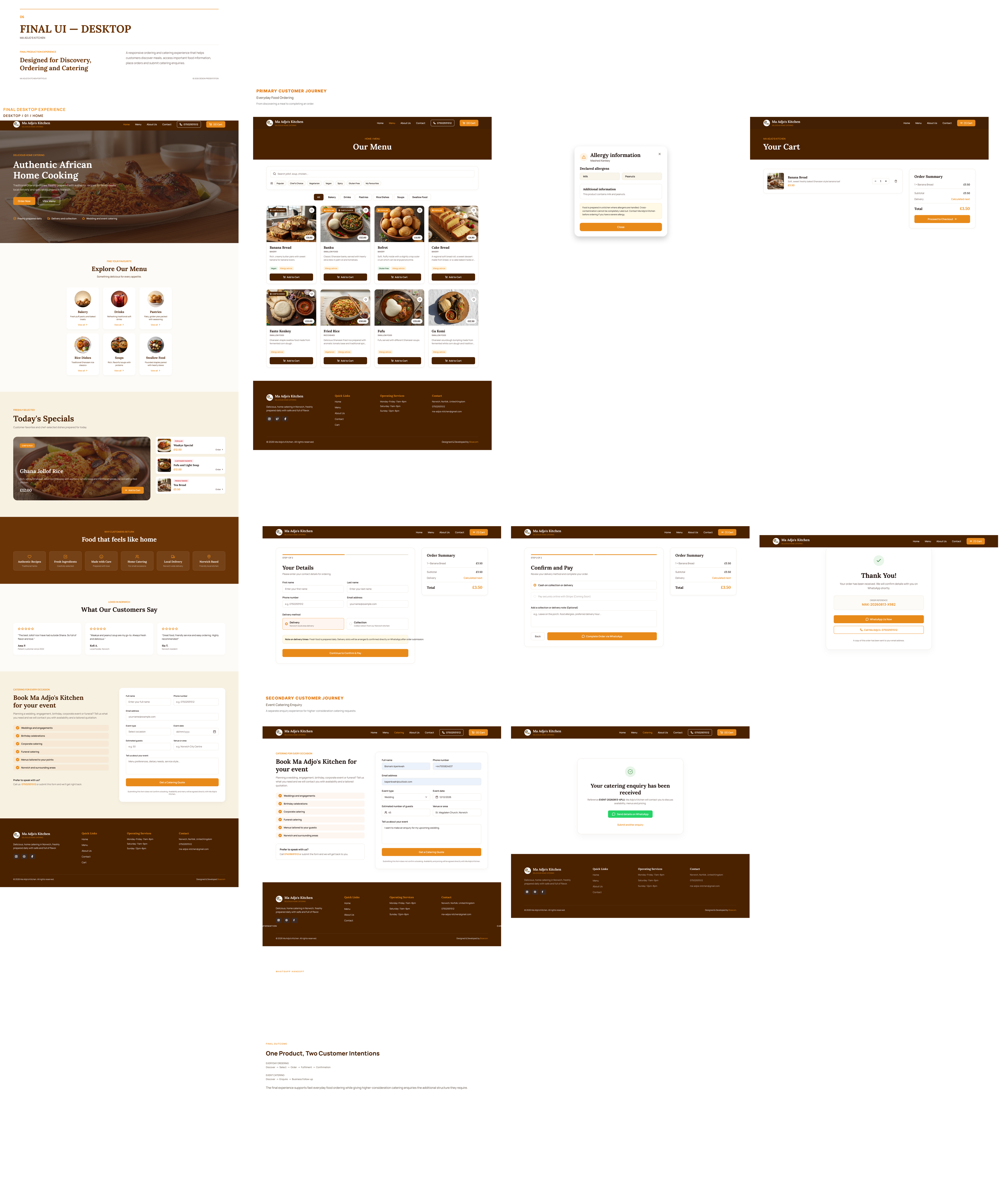
The final desktop experience guides customers through a clear end-to-end ordering journey, from discovering meals on the homepage to browsing the menu, reviewing allergen information, managing their cart, completing checkout and receiving order confirmation. Alongside the primary ordering flow, a secondary catering enquiry journey allows customers to submit event details directly through the website. The experience uses consistent navigation, clear calls to action and focused transactional steps to reduce friction while preserving the personal service of Ma Adjo’s Kitchen.

Final desktop UI presentation for Ma Adjo’s Kitchen showing the responsive food ordering experience, including homepage discovery, menu browsing, allergen information, cart, checkout, payment, order confirmation and catering enquiry flows.
Final desktop experience showing the complete customer journey from food discovery and menu browsing through cart, checkout and order confirmation, alongside the secondary catering enquiry journey.

Experience 02

02 — Mobile Ordering Experience

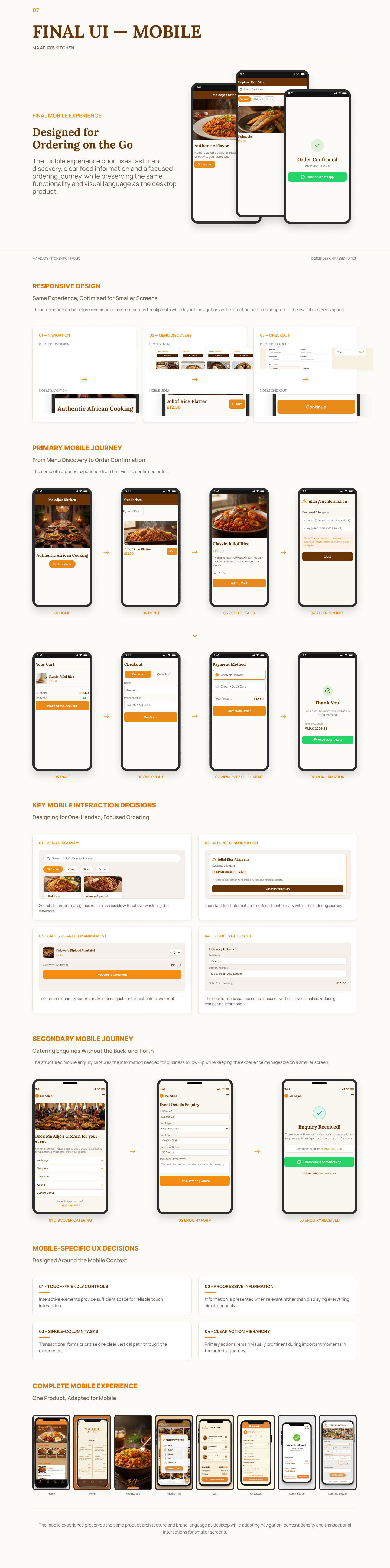
The final mobile experience adapts the complete Ma Adjo’s Kitchen ordering journey for smaller screens, guiding customers from homepage discovery and menu browsing through food selection, allergen information, cart management, checkout, payment and order confirmation. The experience prioritises one-handed use through touch-friendly controls, simplified navigation, single-column layouts and clear calls to action. A secondary mobile catering flow also enables customers to submit event enquiries while maintaining a focused and consistent experience across the product.

Final mobile UI presentation for Ma Adjo’s Kitchen showing the responsive ordering journey across homepage discovery, menu browsing, food details, allergen information, cart, checkout, payment, confirmation and catering enquiry screens.
The mobile experience adapts the same product architecture for smaller screens using simplified navigation, touch-friendly controls, focused layouts and clear actions throughout the ordering journey.

Prototype

Testing the complete journey

The interactive prototype demonstrates the core Ma Adjo’s Kitchen customer journey, from discovering the menu and selecting a meal through cart management, checkout, payment selection and order confirmation. Key interactions were connected to demonstrate navigation, product selection, quantity management, form completion, validation and recovery states. The prototype was used to assess the continuity of the experience across key touchpoints before translating the approved designs into the final responsive product.

08 — Edge Cases & System States

Designing beyond the happy path

A successful ordering experience must account for situations where customers cannot complete the expected journey. I designed key edge cases around menu availability, form validation, checkout and order submission to ensure customers receive clear feedback, understand what went wrong and have an obvious path to recovery.

Edge Case 01

01 — Item Unavailable

Scenario

A customer attempts to select or order a menu item that is temporarily unavailable.

Problem

Allowing unavailable dishes to progress into the ordering journey could create frustration, require manual intervention and result in orders the business cannot fulfil.

Response

Unavailable items are clearly identified within the menu and their ordering action is disabled, preventing customers from adding them to the cart while keeping the item visible for context.

Why it matters

Unavailable items are clearly identified within the menu and their ordering action is disabled, preventing customers from adding them to the cart while keeping the item visible for context.

Edge Case 02

02 — Delivery Unavailable

Scenario

A customer selects delivery but enters an address outside Ma Adjo’s Kitchen’s supported delivery area.

Problem

Allowing the customer to continue without validating the delivery location could result in an order that the business cannot fulfil.

Response

The checkout clearly explains that delivery is unavailable for the entered address and provides two recovery options: switch to collection or change the delivery address.

Why it matters

Validating fulfilment availability before payment prevents failed orders while giving customers a clear path to continue rather than abandoning checkout.

Edge Case 03

03 — Payment Failure

Scenario

The customer's online payment does not complete successfully during checkout.

Problem

A failed transaction can create uncertainty about whether the order was placed and may cause the customer to restart the entire ordering process.

Response

The order and checkout information are preserved. The customer receives a clear payment failure message and can retry the payment or select an alternative payment method.

Why it matters

Preserving the customer's order reduces frustration, prevents unnecessary repetition and provides a straightforward recovery path to complete the purchase.

Edge Case 04

04 — Enquiry Error

Scenario

A customer attempts to submit the catering enquiry form with missing, incomplete or invalid required information.

Problem

Submitting incomplete information could prevent Ma Adjo’s Kitchen from properly understanding or responding to the catering request.

Response

Inline validation identifies the affected fields, provides clear guidance on what needs correcting and preserves information already entered so the customer can make corrections without restarting the form.

Why it matters

Clear validation improves the quality of catering enquiries while reducing customer frustration, unnecessary re-entry and incomplete submissions.

09 — Development & Implementation

Turning product decisions into a working experience

Following the design phase, I translated the approved experience into a responsive, production-ready web application. I implemented the interface using Next.js, TypeScript and Tailwind CSS, while Sanity CMS provides structured content management for menu items, pricing, images and availability. The implementation focused on maintaining consistency between the final designs and the live experience while supporting responsive behaviour, reusable components, content management and the complete customer journey from menu discovery through ordering and catering enquiries.

Role in Implementation

Product Designer & Front-End Developer

Technical Architecture

Layer 01

Next.js + TypeScript

Customer-facing application

Page routing and application structureMenu and product interfacesCart and checkout experienceCatering enquiry experienceResponsive UI components

Layer 02

Sanity CMS

Structured content and menu management

Menu item managementProduct pricingFood imageryProduct availabilityEditable business content

Layer 03

Tailwind CSS

Responsive presentation layer

Design-system implementationResponsive layoutsConsistent spacing and typographyComponent statesMobile and desktop adaptation

Layer 04

Vercel

Production hosting and deployment

Production hosting and deploymentBuild pipelineEnvironment configurationApplication hosting

Client Control

CMS & Content Management

Sanity CMS was integrated to separate business content from the application code, allowing the client to manage key information without developer intervention. Menu items, prices, images and availability can be updated through a structured administrative interface while the customer-facing website retrieves and presents the latest published content. This approach makes the product easier to maintain and gives the business greater control over day-to-day content changes.

Responsive Implementation

One Product, Multiple Breakpoints

The interface was implemented responsively rather than treating mobile as a scaled-down desktop experience. Navigation, content density, grids, forms and checkout interactions adapt according to the available viewport while maintaining the same underlying information architecture and brand language. Particular attention was given to touch-friendly controls, readable content, single-column mobile forms and clear primary actions throughout the ordering journey.

Implementation Highlights

01 — CMS-Driven Menu

Menu content was connected to Sanity CMS so products, pricing, imagery and availability can be maintained independently of the application code.

02 — End-to-End Ordering Flow

Implemented the customer journey from menu discovery and product selection through cart, checkout and order confirmation.

03 — Catering Enquiry Flow

Built a dedicated catering enquiry experience that captures structured event information and provides clear validation and submission feedback.

04 — Reusable UI Components

Converted recurring interface patterns into reusable components to improve consistency, maintainability and scalability across the product.

05 — Responsive Experience

Implemented adaptive layouts and interaction patterns to preserve the core ordering experience across desktop, tablet and mobile screen sizes.

Deployment Status

Live

10 — Impact & Outcomes

From business problems to product outcomes

The project transformed Ma Adjo’s Kitchen’s requirements into a responsive digital ordering and catering experience that customers can use across desktop and mobile. The delivered product brings menu discovery, product information, cart management, checkout and catering enquiries into a coherent experience while giving the business control over key content through the CMS. The outcome is a production-ready digital foundation that supports the business’s current ordering workflow while creating room for future optimisation as real customer usage data becomes available.

Delivered Outcomes

Responsive Ordering Experience

Delivered a responsive customer experience covering menu discovery, product selection, cart management, checkout and order confirmation across desktop and mobile.

Structured Menu Discovery

Organised menu content into a clear browsing experience that allows customers to discover dishes and access relevant product information before ordering.

End-to-End Ordering Journey

Implemented the core ordering journey from product selection through cart, customer details, fulfilment and confirmation.

Dedicated Catering Enquiry Journey

Delivered a structured catering enquiry experience that allows customers to submit event requirements through the website rather than relying solely on informal back-and-forth communication.

Client-Manageable Content

Integrated Sanity CMS so key business content can be maintained without requiring code changes for routine updates.

Responsive Cross-Device Implementation

Adapted the product architecture, navigation, content hierarchy and transactional interactions for desktop and smaller mobile screens.

Expected Business & UX Impact

Reduced Ordering Friction

A structured digital ordering journey is expected to make it easier for customers to move from discovering meals to completing an order.

Improved Menu Accessibility

Centralising menu information, pricing and product details should make it easier for customers to understand the available offering before ordering.

More Structured Catering Leads

The dedicated enquiry flow is expected to provide the business with more complete event information upfront and reduce unnecessary back-and-forth communication.

Greater Operational Control

CMS-managed content should allow the business to maintain key website information more efficiently as its offering changes.

Stronger Mobile Customer Experience

The responsive implementation is expected to reduce friction for customers browsing and ordering from mobile devices.

Success Metrics / Future Measurement

Order Completion Rate

Percentage of customers who begin checkout and successfully complete an order.

Cart Abandonment Rate

Percentage of customers who add items to their cart but leave before completing checkout.

Checkout Completion Time

Time required for customers to progress from cart to successful order confirmation.

Catering Enquiry Completion Rate

Percentage of users who start and successfully submit the catering enquiry form.

Mobile Conversion Rate

Percentage of mobile visitors who successfully complete the primary ordering journey.

Error / Recovery Rate

Frequency of checkout, validation or payment errors and whether customers successfully recover from them.

11 — Reflection & Next Steps

Learning from the product and looking forward

Designing and implementing Ma Adjo’s Kitchen reinforced the importance of balancing customer needs, business requirements and technical feasibility. The project evolved beyond creating an attractive food-ordering interface into designing a complete service experience covering menu discovery, ordering, fulfilment, catering enquiries, responsive behaviour and content management. Working through the product from design to implementation also exposed practical considerations that are less visible in static UI work, including responsive behaviour, content flexibility, error states, CMS structure and maintaining consistency as the product evolved.

01

1. Design Beyond the Happy Path

Designing the main ordering journey was only part of the solution. Considering unavailable products, delivery limitations, payment failures and form errors helped create a more resilient customer experience.

02

2. Design With Real Content

Food imagery, menu descriptions, prices, allergens and availability significantly affect the interface. Designing around realistic content helped reveal layout and hierarchy issues earlier.

03

3. Responsive Design Is More Than Scaling

The mobile experience required deliberate changes to navigation, information density, interaction patterns and checkout rather than simply reducing the desktop layout.

04

4. Implementation Informs Better Design

Taking the product through implementation highlighted how component structure, CMS requirements, responsive behaviour and technical constraints influence design decisions.

Key Trade-offs

Decision

1. Simplicity vs Feature Depth

Why

Prioritised a focused ordering experience over introducing unnecessary features that could increase complexity for customers and the business.

Trade-off

Advanced features and additional customisation were deferred to keep the initial ordering journey simple, focused and easier to maintain.

Decision

2. Business Flexibility vs Interface Consistency

Why

The CMS needed to give the business enough control to update content while maintaining predictable layouts and design-system consistency.

Trade-off

Client editing freedom was intentionally constrained to structured CMS fields rather than unrestricted page editing, protecting layout and visual consistency.

Decision

3. Digital Automation vs Existing Operations

Why

The product digitises key customer interactions while retaining practical fulfilment processes appropriate for the business rather than over-engineering the operational model.

Trade-off

Some fulfilment activities remain dependent on existing manual processes rather than being fully automated, reducing technical complexity while fitting the business's current operating model.

What Still Needs Validation

1. Checkout Behaviour

Validate where customers hesitate or abandon the ordering journey and identify opportunities to reduce friction.

2. Menu Discoverability

Evaluate whether customers can quickly find relevant dishes, understand categories and access the information needed to make a decision.

3. Catering Enquiry Experience

Assess whether the enquiry form captures enough information for the business without creating excessive effort for prospective customers.

4. Mobile Usability

Validate the mobile ordering experience with real customers, particularly navigation, product selection, cart management and checkout.

Next Steps

1. Introduce Product Analytics

2. Conduct Post-launch Usability Testing

3. Optimise the Ordering Funnel

4. Improve Accessibility

5. Iterate Based on Real Usage

What I Would Do Differently

With more time and access to a larger customer sample, I would introduce usability testing earlier and repeat it throughout the design and implementation process rather than relying primarily on design review and functional validation. I would also establish analytics and event tracking before launch so that key behaviours such as menu engagement, add-to-cart actions, checkout abandonment and catering enquiry completion could be measured from the beginning. This would provide stronger evidence for prioritising future iterations and allow design decisions to be evaluated against real customer behaviour.

Final Reflection

Ma Adjo’s Kitchen demonstrated the value of treating product design as more than the production of screens. The strongest decisions emerged from considering the entire system: customer goals, business operations, responsive behaviour, content management, edge cases and technical implementation. Taking the project from problem definition through design and implementation strengthened my understanding of the relationship between design intent and the realities of a working product. Most importantly, it reinforced that launch is not the end of the design process. The next stage is to learn from real usage, measure behaviour and continuously improve the experience based on evidence.

More Work

Explore more selected projects

Back to Projects →